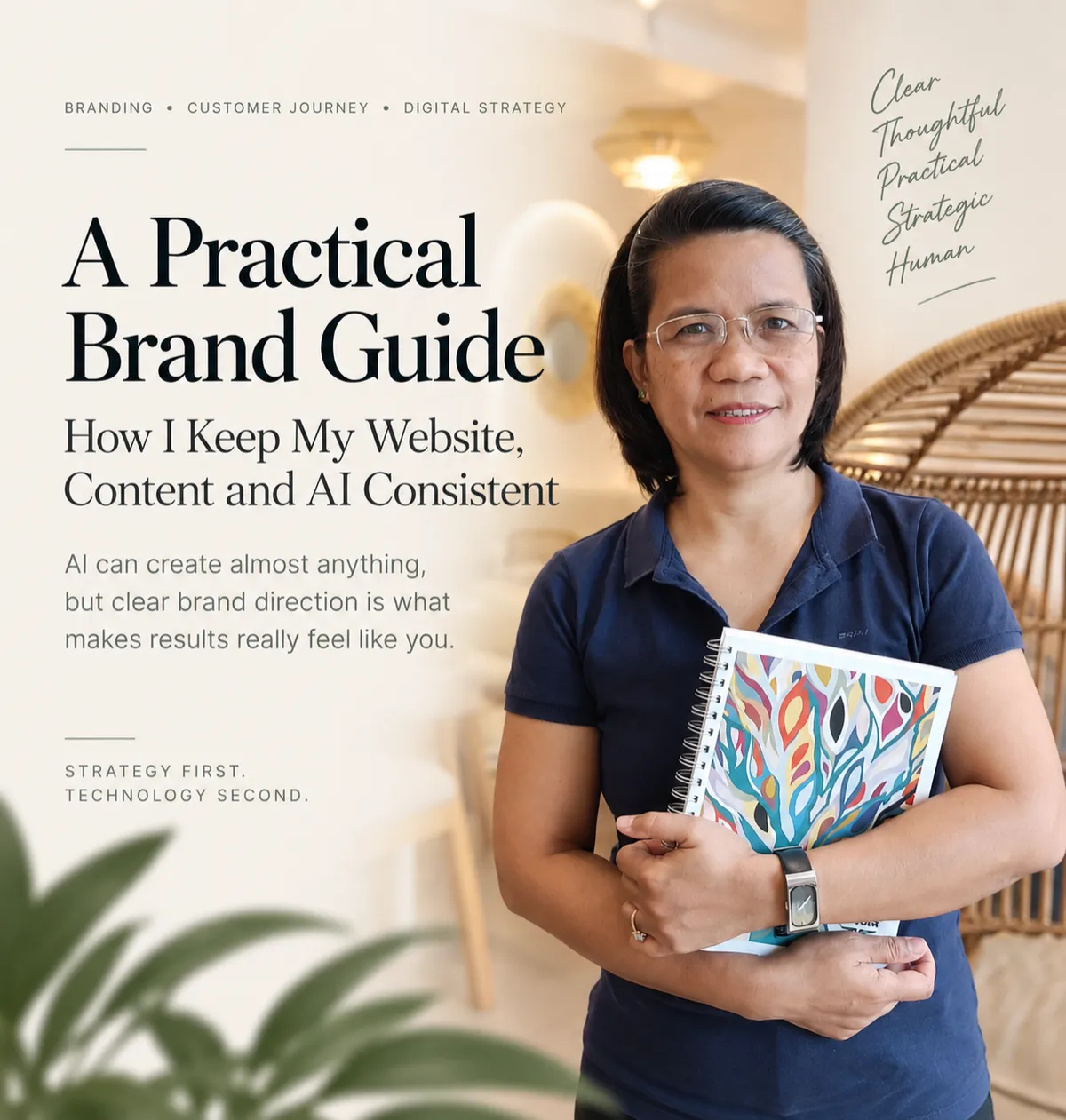
A Practical Brand Guide: How I Keep My Website, Content and AI Consistent
When I first started shaping my brand as Divine Balubar, I was excited by how quickly AI could turn loose thoughts into something that looked polished. In a few prompts, I had colour palettes, logo ideas, page layouts, even paragraphs of copy that sounded almost like me. But “almost” is the key word. The more I generated, the more I realised that speed without direction just gave me more options to sift through. I needed to decide what my brand actually stood for before asking any tool to help me express it.
That tension is what pushed me to build a simple, practical brand guide for myself. Not a glossy agency deck, just a calm, strategic reference I could use across my website, content, and AI workflows. Because in the end,AI can create almost anything, but clear brand direction is what makes results really feel like you.
1. Start With How You Want the Brand to Feel
Before I chose a single colour or font, I wrote down three words I wanted people to feel when they landed on my website or read something from me:calm, considered, trustworthy. I was less interested in being “disruptive” and more focused on feeling grounded and useful, especially for people who are already overwhelmed by digital noise and shiny tools.
Those feelings became a quiet filter for every decision. Did this layout feel calm or cluttered? Did this sentence sound considered or rushed? Did this colour combination feel trustworthy or a bit too loud? When I later briefed AI, I used those words directly in my prompts. It meant I was not asking, “Make this look cool,” but, “Make this feel calm, strategic and human.” The difference in output was noticeable straight away.
2. Keep the Visual System Simple
Early on, I made the mistake of over-collecting. I had too many colours, too many layout variations, and endless “just in case” styles. It looked interesting in isolation, but together it felt like different brands stitched into one site. So I pared everything back to a small, neutral palette that felt like me: deep blue (#112842), soft light green (#82a8a4), a gentle light neutral (#dde6d9), a grounded green (#3a5a61), and white for breathing space. That was enough.
Instead of chasing novelty, I focused on repetition. Buttons look the same across pages. Headings follow a consistent hierarchy. Spacing is predictable. This simplicity makes it easier for visitors to relax and focus on the content, not the interface. It also makes AI easier to use: when I generate layout ideas or component suggestions, I already know the colours and structure they need to fit into, so I am not starting from a blank canvas every time.
3. Choose Fonts With Different Jobs
Typography is one of those details people do not always notice consciously, but they feel it. I treat fonts like roles in a small team. My heading font needs to be clear, confident and easy to scan. My body font needs to be readable for longer pieces, with a softer, more conversational tone. Accent text can be slightly different, but not so different that it feels like a new brand each time it appears.
For my own system, I use one clean sans serif for headings and navigation, and a warmer serif for longer paragraphs. When I ask AI tools to design sections or suggest styles, I specify the roles: “Use a clear, modern sans serif for headings and a readable serif for body text.” That one line keeps suggested designs aligned with the feel I am going for, instead of letting the tool swap fonts on a whim. Fonts stop being decoration and start becoming part of the structure of the brand.
4. Brand Voice Matters as Much as Visual Identity
It is easy to obsess over colours and logos and then treat words as something you “fix later”. I did that at first. I had a cohesive visual style, but the copy swung between formal, chatty, and slightly salesy depending on the day and my mood. It did not feel like one person speaking. So I sat down and defined how I wanted to sound: professional but warm, strategic but not stiff, confident without hype, with a preference for clear, plain language over buzzwords.
I wrote a short voice guide just for myself: phrases I like, phrases I avoid, how I explain complex ideas in simple terms, and how I talk about AI without making it the hero. Now, when I use AI to draft copy, I paste that guide into the prompt. I ask it to sound “calm, practical, and human, in Divine Balubar’s voice”. I still edit everything, but the baseline is much closer to how I naturally speak. The goal is that someone who meets me in person and then visits my website feels no jarring difference in tone.
5. Decide What Your Brand Will Not Do
One of the most grounding parts of my brand guide is the “not this” section. It is a simple list of things I deliberately avoid: no fear-based messaging, no manufactured urgency, no over-promising, no pretending AI can replace strategy or human judgement. I also avoid jargon-heavy explanations that make people feel small or behind. My work is about clarity, not confusion.
This “not” list is especially important when working with AI, because tools will happily generate whatever is statistically common. If I do not say otherwise, it will suggest clichés, pushy hooks, or overconfident claims that are everywhere online. Having clear boundaries means I can tell AI, “Avoid scarcity tactics, avoid exaggeration, and do not promise overnight results.” It is a quiet way of protecting the integrity of my brand, even when I am moving quickly.
6. Real Images Make a Personal Brand More Personal
I appreciate how good AI-generated visuals have become, but for a personal brand, I find that real images of real moments still carry a different weight. When someone chooses to work with me, they are not hiring a generic “AI strategist”; they are choosing a person with a way of thinking, a way of listening, and a way of working. Stock-style images can smooth over that difference, but they also flatten it.
On my site and in my content, I mix considered, well-lit photos with more candid shots of my actual workspace and process. I still use AI to help with cropping, colour correction, or layout ideas, but the source material is mine. This keeps my brand grounded in reality. People see the same person on the website, on a call, and in my content. That visual continuity is part of how trust is built over time, and it is hard to fake convincingly with generic imagery alone.
7. AI Still Needs Direction
The more I work with AI, the clearer this becomes: tools are brilliant at amplifying direction, not replacing it. If my brief is vague, the output will be vague. If my brand decisions are scattered, the content will be scattered. But when I give AI a clear brand guide – colours, tone, boundaries, audience, message – it becomes a powerful collaborator that saves me hours of drafting and re-drafting.
I treat AI like a capable assistant who has never met my audience before. It needs context. I share who I am serving, what they are struggling with, and how I want them to feel at the end of a page or email. I remind it that my brand is calm, not frantic; strategic, not reactive; human, not robotic. The technology accelerates the work, but the strategy still comes from me. That distinction keeps me from outsourcing decisions I actually need to own as a brand.
8. Consistency Is Part of the Customer Journey
Branding is not just what something looks like on launch day; it is the thread someone follows as they move from first touch to working with you. When a potential client discovers me through a post, clicks through to my site, signs up for an email, and eventually books a call, I want that whole journey to feel like one coherent experience. Consistency is not decoration – it is part of how people decide whether they can trust you with their time, money, and attention.
This is where my brand guide earns its keep. It helps me keep headlines, colours, layouts, and language aligned across the website, social content, and AI-generated drafts. If something feels off – a headline that is too loud, a layout that feels cramped, a phrase that sounds unlike me – I adjust it back towards the guide. Over time, this steady alignment makes the experience feel intentional rather than accidental, and that is what a considered customer journey really is: a series of small, consistent signals that say, “You are in the right place.”
9. My Brand Guide Will Keep Evolving
I do not see my brand guide as a fixed rulebook; it is more like a living document that grows as I do. As my work with clients deepens, I notice new phrases that resonate, questions that come up repeatedly, and parts of my process that feel especially valuable. I feed those insights back into the guide. Sometimes that means tightening the “not this” list. Sometimes it means clarifying my voice or refining the way I explain AI’s role in strategy.
The same is true for the visual side. I might adjust how often I use a particular green, or simplify layouts further as I see how people actually move through the site. The point is not perfection; it is alignment. As Divine Balubar, my aim is to keep my brand, my website, my content, and my AI tools working together in service of a clear, human experience. Strategy leads. Technology supports. And the guide I have built is what keeps everything coherent on days when decision fatigue would otherwise take over.
Explore More Insights →